
I’ve found that one of the most effective tools in visualizing energy use is the heat map. I also find them beautiful. Call me an energy geek but visualizing energy use on a calendar is very effective for spotting scheduling energy savings and peak demand issues.
Heat maps can show daily, hourly, or 15-minute data. The calendar variety by design highlights daily information across a year, which is what I’m focusing on for this post. The information can be a peak reading (kW), total usage (kWh), an average across the day (average kW, just a different scale for total usage), or another slice of data (e.g. an average kW during occupied or unoccupied hours).
These charts use a meaningful color range and recognizable arrangement to beautifully display data. Color is used like a z-axis (like height) to convey magnitude. They’re compact, especially for the calendar layout, making them easily identifiable. With one point per day, it also fits nicely across a page.
The Basics
The essence of the calendar heat map is viewing data over at a glance. Imagine a calendar, tipped on its side so the days of the week run vertically:
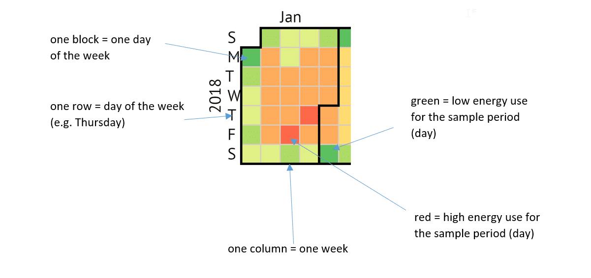
Almost every time our engineers look at a building’s energy use this way, we discover actionable insights, often which are scheduling errors. You can easily see energy use and how energy use varies across unoccupied days such as weekends and holidays.
Examples
Let’s look at some real-world heat maps we’ve seen on our projects.
Predictable Scheduled Energy Use
The heat map below shows energy use of a well-scheduled high school. You can tell its schedule is making the grade because of the:
- green blocks showing low energy use during school closures/minimum occupancy (weekends, summer, holidays and breaks)
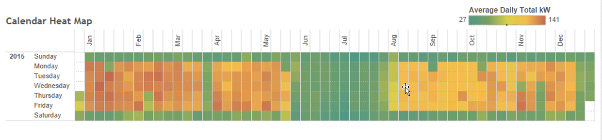
Example 1: A Well-Scheduled High School
Continuous Occupancy Facilities
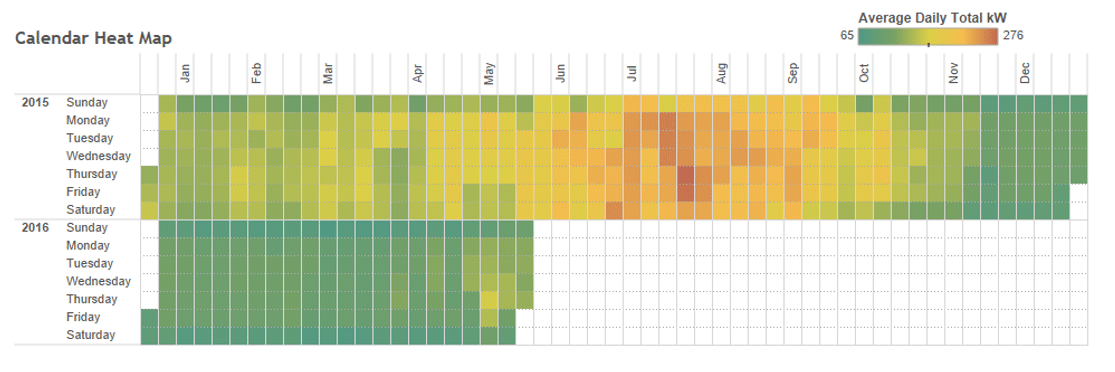
The following map shows energy use at a small university graduate student research lab which is usually occupied every day of the week. You’ll notice:
- average energy use every day (except breaks)
- summertime energy use
The electric use is higher in mid-summer because of higher cooling loads. The very low use over winter break occurs when everyone goes home.
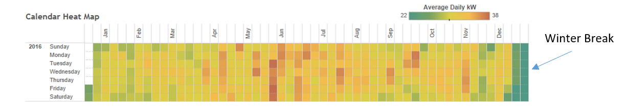
Example 2: A Seven-Day Use Facility
Tips for Analyzing Heat Maps
You need to watch out for the color range of heat maps. It is typically fully scaled for the data so it’s not absolute. In certain situations, green doesn’t necessarily mean good (low usage) or that red is bad (high usage).
The scale represents the facility’s energy use. Green is low for that facility and red is high for that facility. You still need to evaluate the magnitude of the readings.
You can take advantage of this color scale issue when comparing sites. With a fixed color scale across sites, you can see absolute differences, i.e. which site has higher use. You can also see relative differences when you use a normalized reading such as kW/ft2.
Comparing Energy Use Between Buildings
In the example below comparing two schools, Site 2 appears to be used throughout summer, while Site 1 does not. Site 2 has a higher total energy use. Its heat map also shows more Saturday use. This could be a result of weekend occupancy or that there’s an equipment scheduling error and something is not turning off.
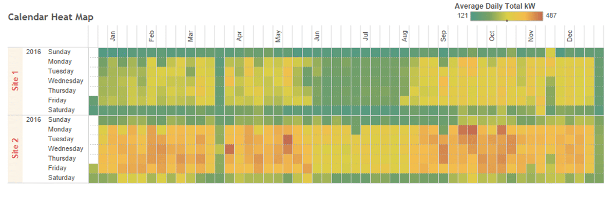 Example 3: Comparing Energy Use of Two High Schools
Identifying Changes and Savings Opportunities
The same color scale across a single site can also show changes in energy use over time. In the example below, we see a substantial energy reduction and improved weekend scheduling at an office building as the result of a retro-commissioning project. You see a big change (much more green) in early 2016 compared to the previous year. Saturdays and Sundays also show consistent low use throughout 2016.
Example 4: Office Building with Energy Saving Project in Late 2015
In our last example we look at hot water use. This heat map shows heating hot water used at the same graduate research center from our previous example. We know everyone went home for winter break based on the electricity heat map. Looking at the chart below, we see that hot water use during the break is the highest even though no one is there! Trimming that use while school’s out is a great energy efficiency opportunity.
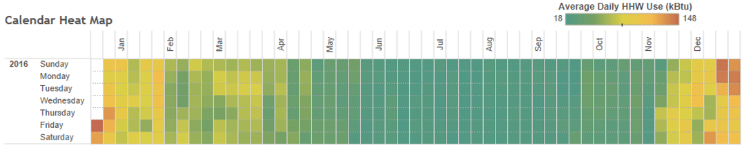
Example 5: Heating Use at Graduate Research Facility
Deeper Dive
When moving on to other energy use analysis (such as load profiles), heat maps can be useful in determining if filtering data would affect averaging. For example, if we see that spring break use was low for one week in April, we would remove that data when looking at average weekday loads so that it doesn’t show an artificial (false) reduction.
Also, heat maps do not show weather correlation. So it’s important not to get caught up on a certain level of day to day variation. Larger, seasonal patterns can definitely be observed, but other tools, such as temperature scatter plots or weather normalization, could be used for more analysis.
Anomalous days can be useful for understanding energy patterns. For example, if we see from a heat map that a site was not used over a holiday, we can take a detailed look at the load of the site over that day, using a load profile chart, to understand exactly what was still operating. In one of our recent projects, we discovered that a high school’s stadium lights were on when we saw a load plateau from 5pm to 8pm over Veteran’s Day.
Heat Map Wrap Up
Calendar heat maps are simple, beautiful, and effective. Simple to understand even though they represent a lot of data in a compact visual. Beautiful in the use of color gradients and a recognizable arrangement of the data. Effective at identifying scheduling opportunities for energy and cost savings. Lastly, they’re tons of fun to work with for the energy geek, as well as everyone else.
If you’re interested in other ways to visualize energy data, check out this article.
Like this post? Share it on LinkedIn.