Trend data analysis one of the most powerful approaches for finding wasted energy in buildings. Each year the amount of data that your building automation system (BAS) can provide is more – literally faster, better and cheaper. But how to you make sense of your newfound mountains of data? BAS data also has some idiosyncrasies that can be a real headache. For instance, some trend output is time-series (e.g. every 5 minutes) and other variables are only recoded upon “change of state”, such as fan on/off status. Just graphing these two types of variables in excel can be a real headache.
Here are three tools that we use everyday for analyzing trend data. They all take some investment to learn, but they’re well worth your time.
Two free ones first, then one SaaS tool:
The Universal Translator
The “UT”, as it’s called is very helpful for logger data and easily solves the problem that I pointed out above. It also has a lot of other great tools built in – all focused on what you need as an energy engineer. Those include regression modelling tools, psychrometric calculations on your data and and even tools for common fault detection algorithms for checking dual duct air handler controls, economizer operation, fan coil controls, and terminal duct controls.
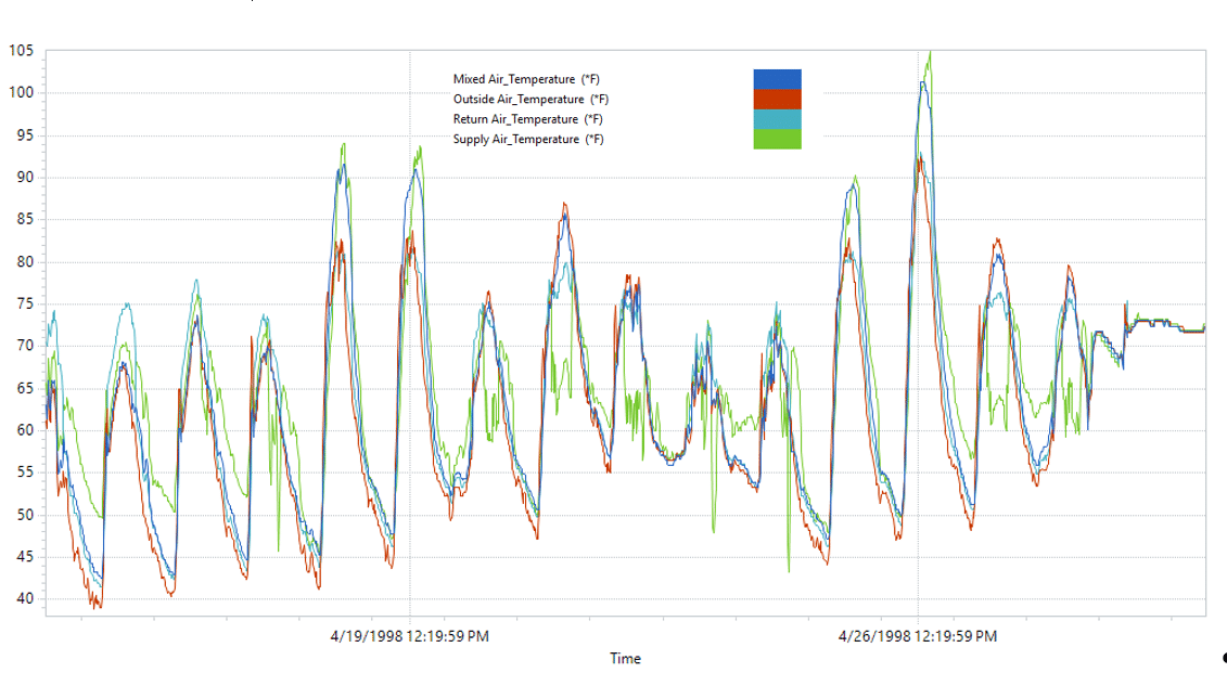
For instance, you might examine this graph long enough to figure out your economizer wasn’t functioning correctly:

But the UT will analyze that data for you to check for appropriate mixed and supply air temps using its built-in diagnostics:

With a quick glance at the actual operation (red dots) vs the ideal operation (blue solid line) you can see that this site looks to be close to 100% outside air operation (the bright green line) than ideal. Looks like you’ve got an actuator or control problem.
ECAM
If you just must use a spreadsheet, then download this Excel VBA add-in (by Bill Koran – way to go Bill!).
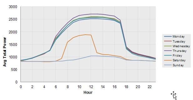
ECAM helps automate analysis of time-series data, filter using schedules that you define, set up scatter plots and other diagnostic plots. E.g. you can use it to turn 8760 rows of data into load profiles by day, by month, by occupancy, etc… It was using ECAM that we were able to spot a simple, cost saving measure at this site:

See the extra high use on the average Thursday profile? Now why would Thursday always be high? We asked the site and they said immediately; “Oh that’s old-chiller Thursday. We have a new chiller but we want to make sure the old one is still functional so we run it every Thursday.” No one on site realized that practice was adding $1000 a month to their peak demand charges. We suggested they make it “old chiller Saturday” instead.
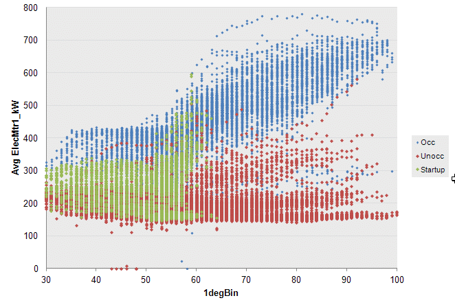
With ECAM and time series data you can also set schedules so that you can identify different operating regimes like this one:

Outside Air Temperature
After defining my schedule, I can then develop separate models for kW as a function of outside air temp, for each of those three operating regimes; occupied, unoccupied, and startup.
SkySpark
Skyspark is what we not use for many of our sites, while it’s not free, it’s the most powerful of the bunch (full disclosure; we’re a value-added reseller but it’s the only product to date we’ve liked enough to put our name on). Skyspark is a full-blown SaaS platform that you can install at a customer site, or in the cloud, push data to it, and do automated fault detection and diagnostics. It’s not free but also not that expensive, you just pay for what you need, and the main cost is the set it up. If your points are tagged well with haystack, or even if you have a consistent point name convention, that time may not be that much.
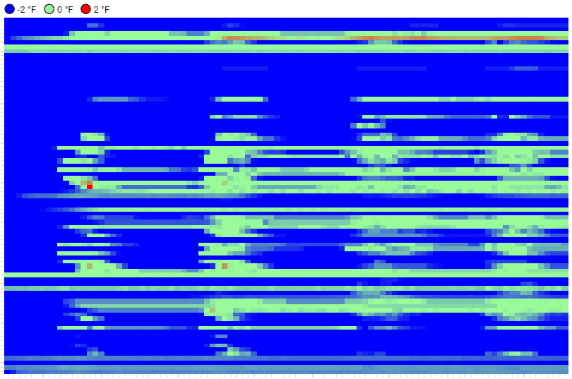
Skyspark is a platform, not just a self-contained tool. It also helps you set up custom visualizations, that our customers love. For example, each row below is a different VAV box in a building. At a glance you can see that the supply air temperature is leading to most zones being too cold:

But the real value is in the automated fault detection, where you don’t have to use someone else’s algorithm – you can create your own. For instance, we recently used SkySpark at a remote desalinization plant to automate alarms. It’s extremely customizable and applicable to all kinds of data, especially time-series data but not only BAS data.
So pick your tool, free or not, and get the most our of your data. Know of a great tool we missed? Let us know.
Like this post? Share it on LinkedIn.

