SkySpark collects and stores data from any number of sources and provides an open analytics platform that can be programmed to automatically make sense of the data and provide insights on a building or a portfolio of buildings.
This open platform can be customized to a great extent, allowing for custom fault detection algorithms, dashboards, automated reporting, and more.
SkySpark helps building stakeholders such as building owners, managers and facility staff identify cost-saving opportunities and potential operational improvements.
What is a SkySpark Dashboard?
Dashboards provide an easy to understand, visual representation of your buildings’ operation by graphing energy usage and operational data. We create custom dashboards for clients within SkySpark, using Axon or Fantom functions and the ViewBuilder App, to help them target areas of interest and easily identify problems.
Dashboards typically make use of custom algorithms used to calculate variables of interest from available data points.
One advantage of dashboards is they allow us to manipulate and group information in meaningful ways, which makes it easier for the user to identify system-level patterns as well as more granular-level outliers.
Custom Dashboard Examples
Here are some examples of SkySpark dashboards we created to assist building energy managers with system optimization. (Note: Some dashboard images have been modified to remove confidential client data.)
Zone Temperatures, Deviation from Setpoints
The dashboard below shows how zone temperatures behave over time in all the zones served by a selected air handler, accounting for zone-by-zone dead-bands. When a zone is satisfied (when the temperature is within the dead-band), it shows up green. When a zone is too cold (temperature below heating setpoint), it shows blue. And when a zone is too warm, it shows red.
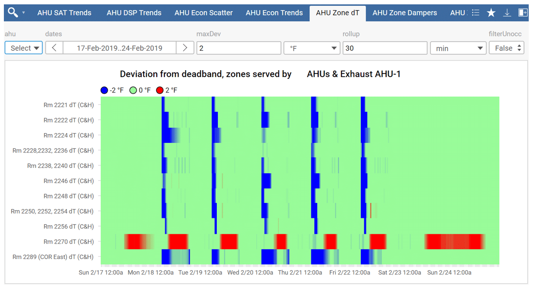
Having this information lined up and displayed for all zones served by one air handler allows us to identify outliers and patterns, which helps us identify zone-level issues and air-handler-level issues or opportunities such as sub-optimal supply air temperature controls.
For example, the dashboard above shows that room 2270 is often too warm, while all the other rooms served by this AHU typically have trouble warming up in the morning.
This would lead us to investigate the warm room to determine if there is a zone-level issue we can address or if there is simply too much load in the room.
The same information would also lead us to consider ways to raise the AHU supply air temperature in the morning to make warm-up easier for the other zones. An outlying zone like this, that may have a big impact on the overall AHU supply air temperature, is sometimes referred to as a “rogue” zone and addressing the root cause can have a big impact on the overall building’s energy use.
Terminal Unit Damper Positions
Similarly, the dashboard below helps us identify terminal unit issues related to supply airflow controls, and air-handler-level issues or opportunities related to duct static pressure controls.
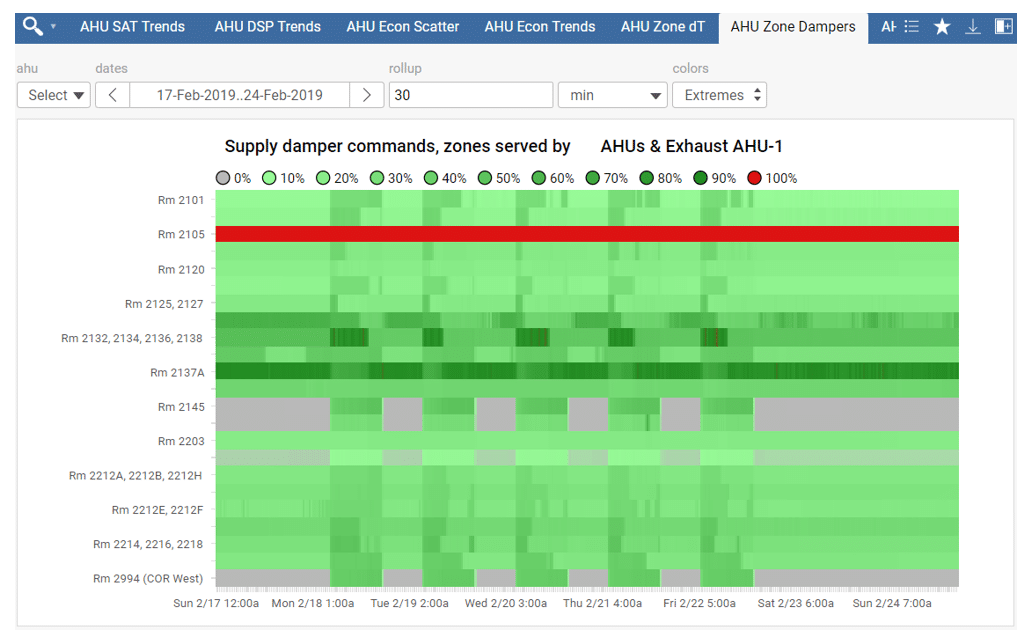
For this dashboard, we chose a color scale that highlights dampers that are fully open or fully closed, while still displaying all the information for damper positions in between.
In the example shown, it is immediately apparent that the terminal unit associated with room 2105 is always fully open, which typically means the supply airflow setpoint isn’t being met.
Our next step would be to review the rest of the trends for room 2105 to identify potential controls issues, or have the room flagged for field inspection of the damper and actuator.
Zone Temperature Dead-bands
This next dashboard allows us to easily monitor the effective zone-level temperature dead-bands for all zones served by a selected air handler.
The temperature dead-band for a zone is the difference between the zone’s cooling setpoint and its heating setpoint. Tighter dead-bands cause higher energy usage and can sometimes cause controllability issues.
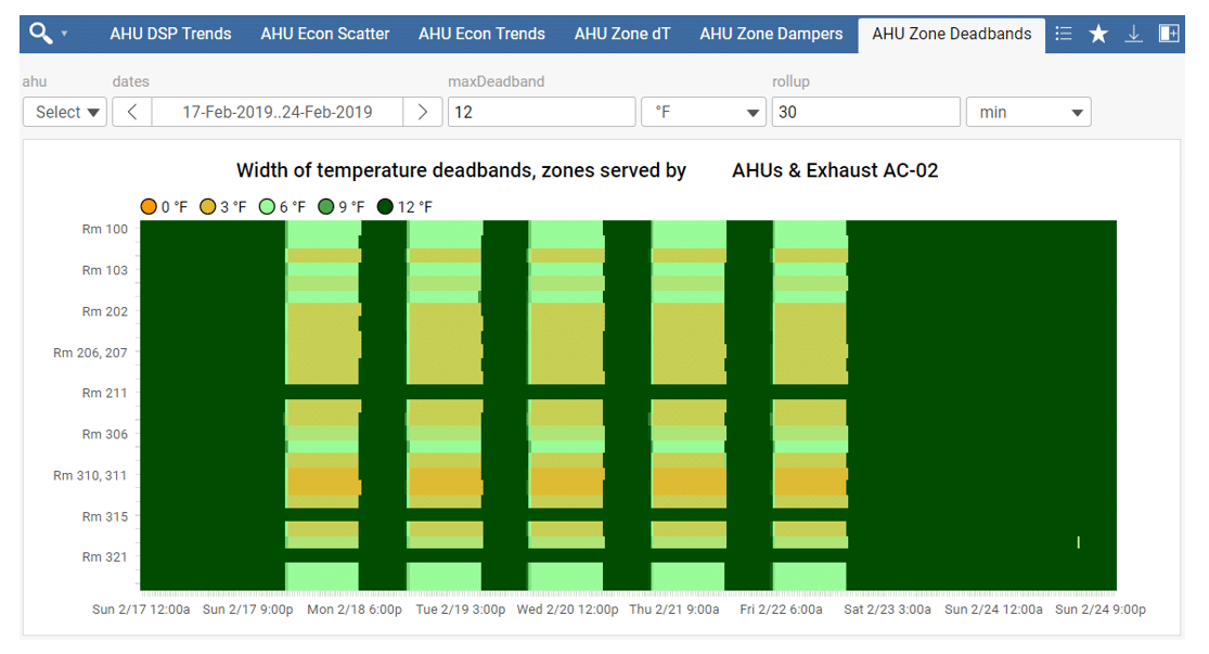
This example shows that all zones served by the selected air handler have ample temperature setbacks during nights and weekends.
It also shows that many zones have temperature dead-bands of only 3°F or 4°F during the day. This could lead us to investigate the opportunity to widen zone temperature dead-bands at the site.
Building Occupancy
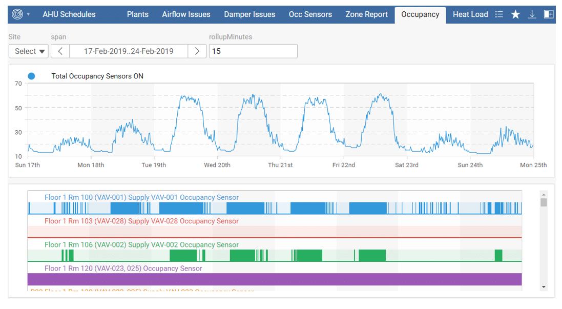
The dashboard below aggregates available occupancy sensor data in a building to offer insights on actual occupancy over time.
Meter and Submeters Energy Breakdown
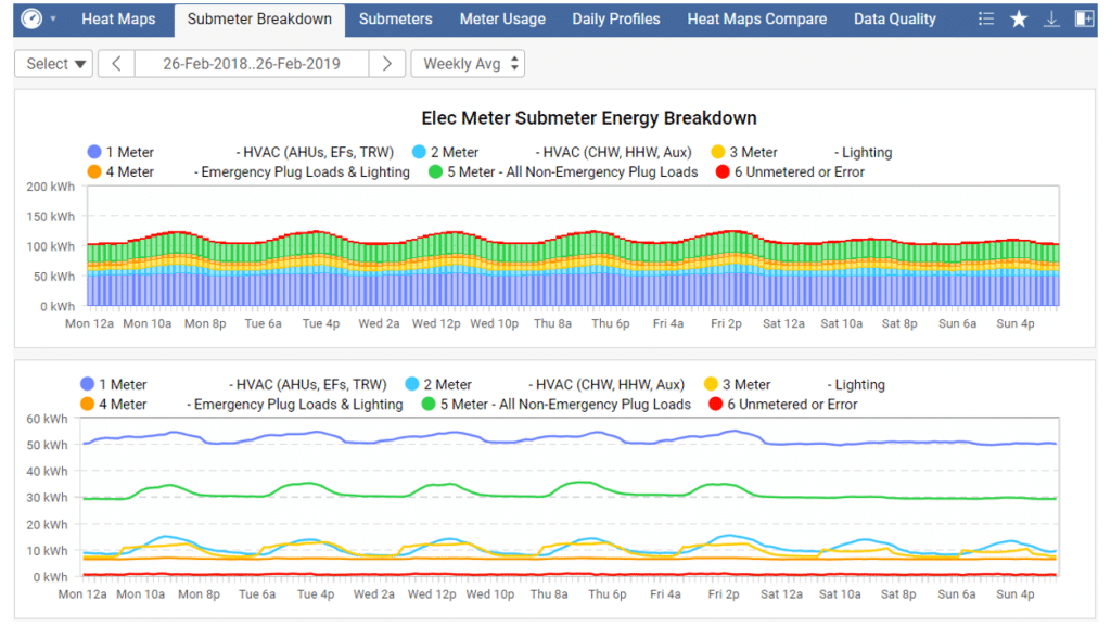
The dashboard below makes use of any available submetering data to display a disaggregation of a selected meter’s energy usage.
It can display daily, weekly or monthly energy usage over a given span of time. It can also use that same data and display weekly average profiles of hourly energy usage, as in the example below.

Such dashboards make it easier to use submeter data to target what systems to investigate. For example, in a building that operates on a schedule, we can determine what submeters typically use the most energy during unoccupied hours and investigate all systems downstream of these.
Fume Hood Sash Heights and Other Smart Labs Dashboards
Laboratory fume hoods require high airflows, when they are open. This results in high cooling, heating and ventilation energy usage.
Additionally, it is safer to keep fume hood sashes closed when hazardous substances are inside and are not actively being used.
The following dashboard summarizes, over a selected period, how often fume hoods in a selected building were closed, slightly open, mostly open and fully open.
It also allows for filtering based on a schedule. For example, it allows the user to view summaries of fume hood sash usage during unoccupied hours.
In the example shown, two of the fume hoods were left fully open during unoccupied hours for more than 10 hours over the past week. Sharing this information with building managers and occupants allows for improved practices over time.

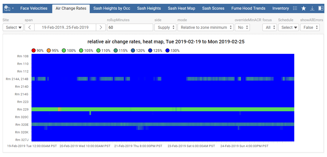
Other laboratory-specific dashboards allow us to monitor fume hood face velocities, and laboratory room air change rates relative to their required minimums (shown below). All these laboratory-related metrics have both safety and energy implications.
Campus Central Plant Operation
We created the following display to summarize chilled water usage for multiple buildings located on a University campus and compare it to the total chilled water production of the central plant. This allows for easy identification of potential issues at specific buildings, which are in turn leading to inefficient plant operation.
In the example shown below, we could easily pinpoint two buildings that should be scheduled but contribute a lot to the overnight campus plant load.

Measured Power vs Expected Power
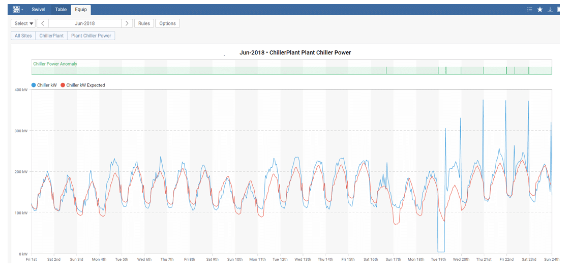
Our custom Anomaly Detection Package utilizes machine learning algorithms to accurately predict equipment performance based on time of day, ambient conditions, and other available variables.
By comparing expected performance to actual performance, we can flag high-level issues for virtually any piece of equipment, which can then help us identify abnormal operation and faults that are hard to detect through other automated means.
The visual below shows measured power use vs. expected power use for an 800-ton chiller. In this example, we were able to quickly identify an issue with chiller staging that was causing abnormal spikes in the power consumption of the plant.
SkySpark’s robust functionality allows users to create custom insights into their buildings resulting in improved building operation and energy savings. Read more about SkySpark and how it can optimize and streamline your building operations, saving you time and money. And feel free to contact us anytime to discuss.
Like this post? Share it on LinkedIn.

